
From idea to final print in your hand
From packaging design to posters, it can feel intimidating to learn dielines, work with printing companies and create something that goes from digital to physical - but it does not have to be! Take on the quest to learn it all!
Video tutorials - helpful tools - pro tips


How it works
Watch videos that cover helpful topics one-by-one
Take on side-quests by checking out linked tools, games and hard-won tips
Speed up your design process by grabbing our templates
Step oneCome along for a full project and get a great foundation
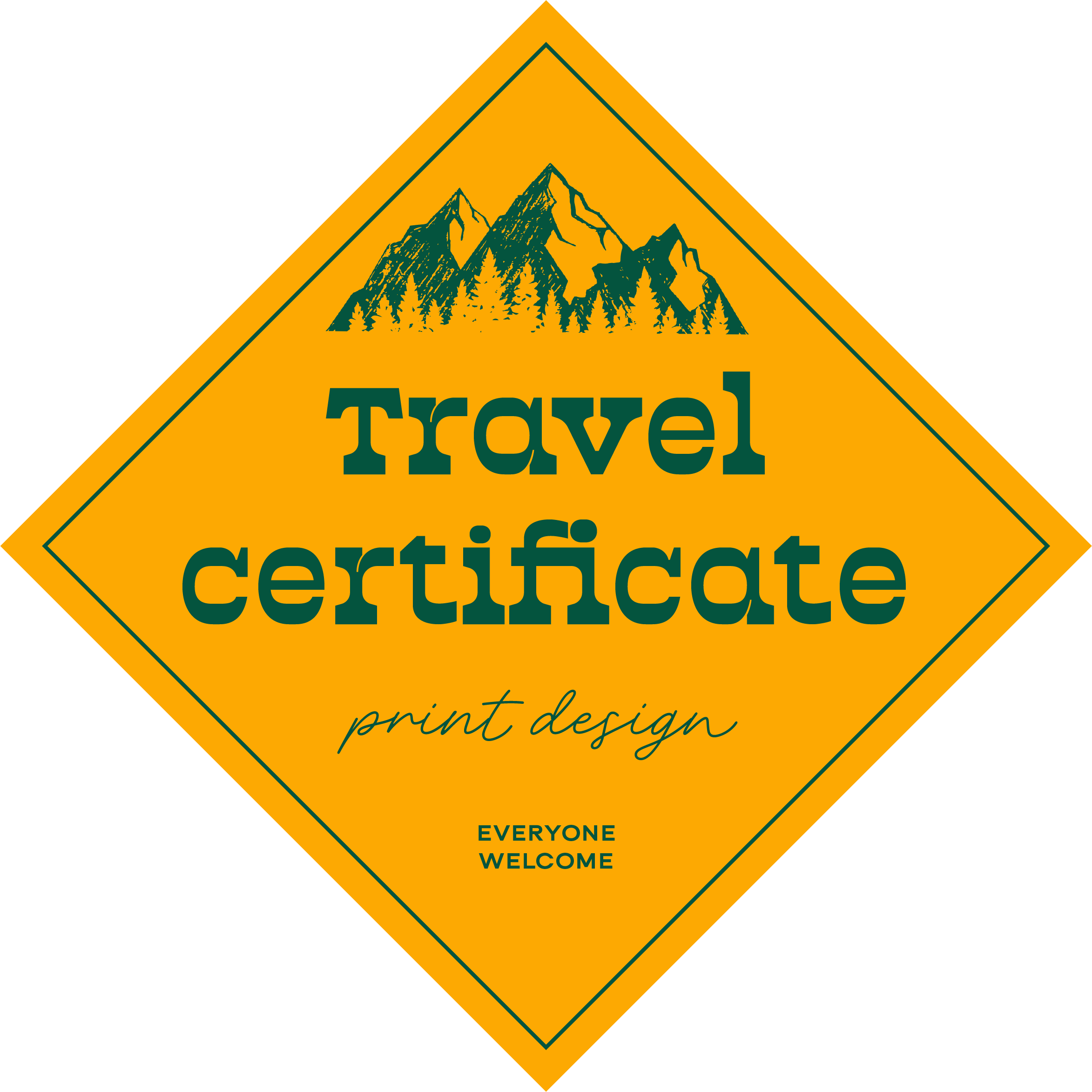
We design and even test print packaging for a stationary brand together. Learn what to keep in mind and how to approach the overall process of print design before diving into specific programs and designs in the next steps.
The big
takeaways
Start with how your design will be used. Where will it live, what should it communicate and what feeling do we want to share?
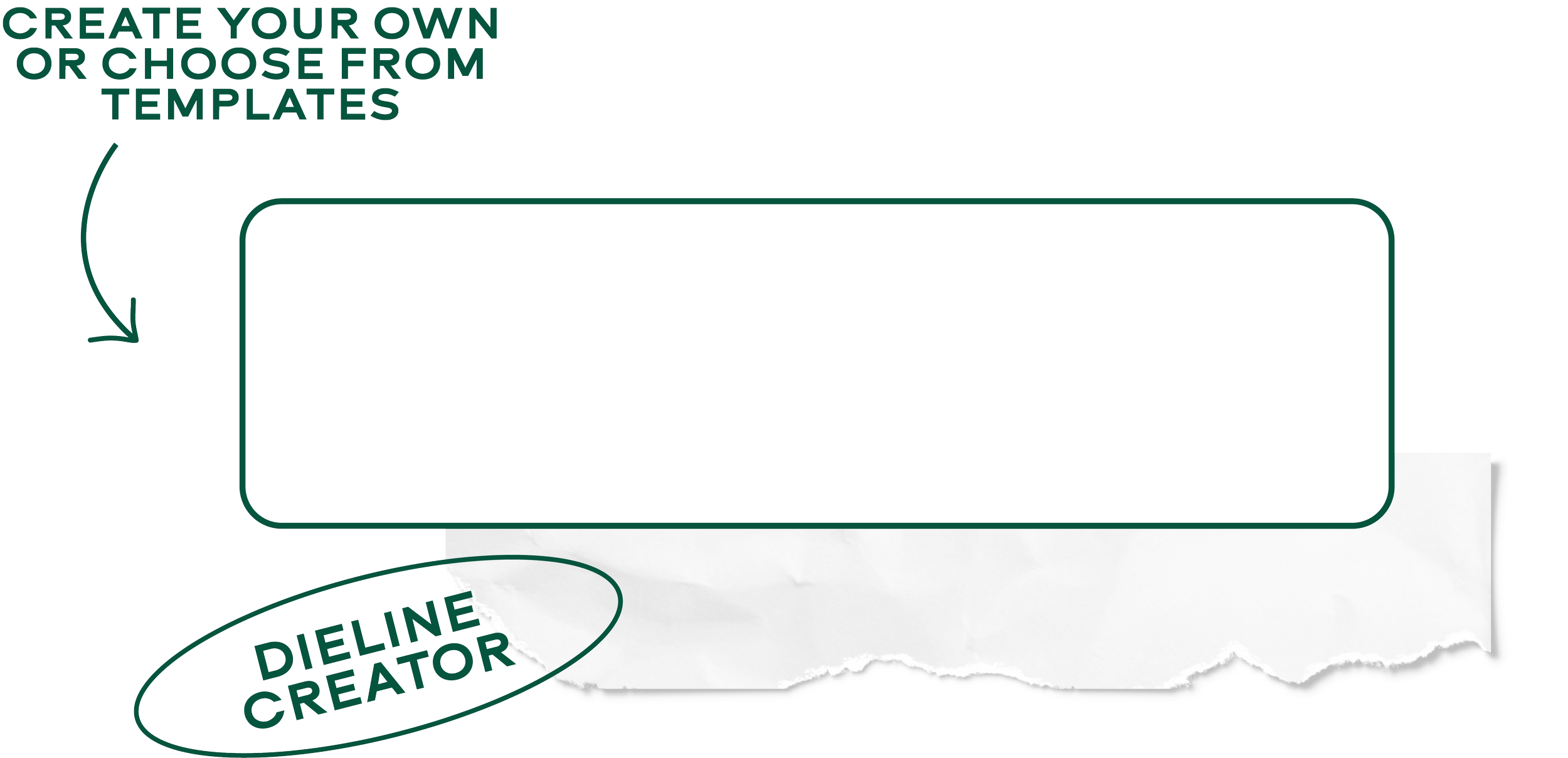
Dielines are your best friend. Have a play around for a personal project to get familiar with how they work.
Think about the full 360 experience. Can you add a sweet message or details to the inside or back of your print design?
Step twoLearn InDesign in 10 minutes
InDesign is specifically created for print, but many designers find it a bit intimidating. This quick 10 minute video will give you all the basics to create your own designs with confidence!
The big
takeaways
Set up right - choose CMYK for your colour profile and add any bleed needed. Also make sure your overall document size matches the brief.
Embed images and fonts to make sure nothing gets lost or distorted in the printing process.
Talk to the printer. Every printer is a little bit different so asking questions is completely normal!
Step threeUpgrade your designs with stunning fonts
Fonts can make your designs endlessly more interesting and even act as graphical hero elements. This guide is a nice introduction to choosing and pairing fonts that work well together!
The big
takeaways
The best font pairings have contrast. Look for styles that give you the right feeling together but that also are distinct from each other.
Readability is key. Always make sure your text will be clearly visible at the size you will use it.
Foundries have exciting and unique options. For projects with a budget for it, purchasing a license to a hero font can be a well worth investment.
Step fourUnderstanding colours
Ever wondered how all the colour profiles, theories and pairings work? This colour breakdown helps you choose colours for your projects in no time!
The big
takeaways
When in doubt, complimentary or monochrome colour palettes are a great go-to.
Colour accessibility is super important for making sure your designs will work in real life.
Working in the right colour profile helps your colours appear the way you intended them to.
Step fivePoster design
Lets put everything we have learned into action! Poster design is a very popular design project and can also be a great addition to your portfolio as a personal project.
The big
takeaways
Start with the text you have to work with and focus on the hierarchy.
Choose a hero element to focus the design around and always consider in what order the information should be read.
Keep an eye on the bleed and colour profile to make sure your design will print just like you want.
Step sixRoll-up banner design
Adobe Illustrator is a great tool for print design and seeing an example project makes it much easier to understand how it all breaks down.
The tips in this video can be used for any print design you want to create in Adobe Illustrator, plus some roll-up banner specific tips!
The big
takeaways
For a print item like this that will be brought to exhibitions and functions, always consider what will be visible at different heights.
Breaking up the text with icons and images help make the design more engaging and easier to take in at a glance.
If your client suggest more text than you think will work, make suggestions for what to cut.